A good friend of mine, who’s opinion I value, has made a suggestion concerning the Source Selection Unit chassis. And I’m looking for some input.
What my friend has suggested is that I don’t round over the corners of the chassis in the fashion I normally do. He has recommended either keeping the edges sharp or maybe adding just a chamfer instead of a round over.
Now the reason I started using the 1/4″ round over on my chassis edges was because I felt (and still do) that it nicely mirrors the curved surfaces on transformer end bells and the curved surfaces of the tubes themselves. But this project is different. This unit will be in a stack with my CD player and potentially a solid state receiver. There will be no visible transformers or tubes. And those other units have somewhat more modern look, sharper edges and styling.
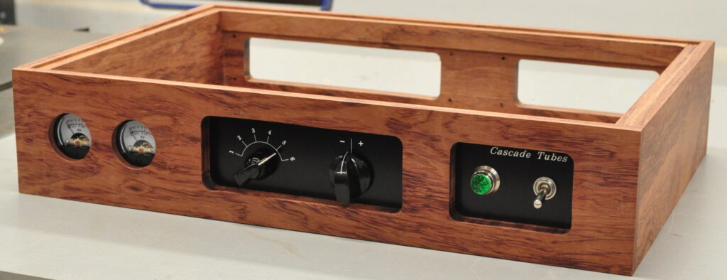
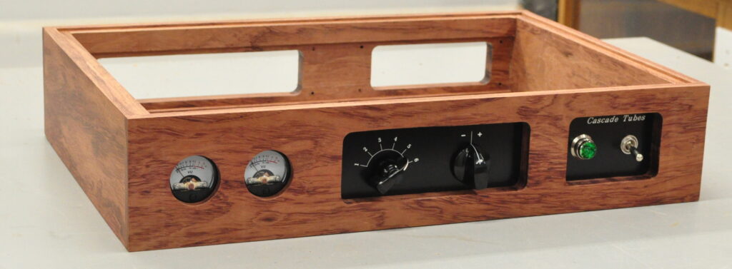
So what I’ve done is insert the frontal control elements in the chassis to see how it looks. Before I give my opinions and feelings, I’ll let everyone see what it looks like.
First, head on:
Then, front the right:
And finally, from the left:
Now at first I kind of liked the look. However, as I spend more time looking at it, there are two things which bother me a little. The first is the shadow line on the top of the openings. This is the first of my audio projects which will actually bear the “Cascade Tubes” moniker. In this configuration I think the name label gets hidden a little. The other thing that bothers me a little is I think it overall has kind of an “unfinished” look. Now this may be just because I’m more used to the strong round overs on the edges. But I’m not really sure.
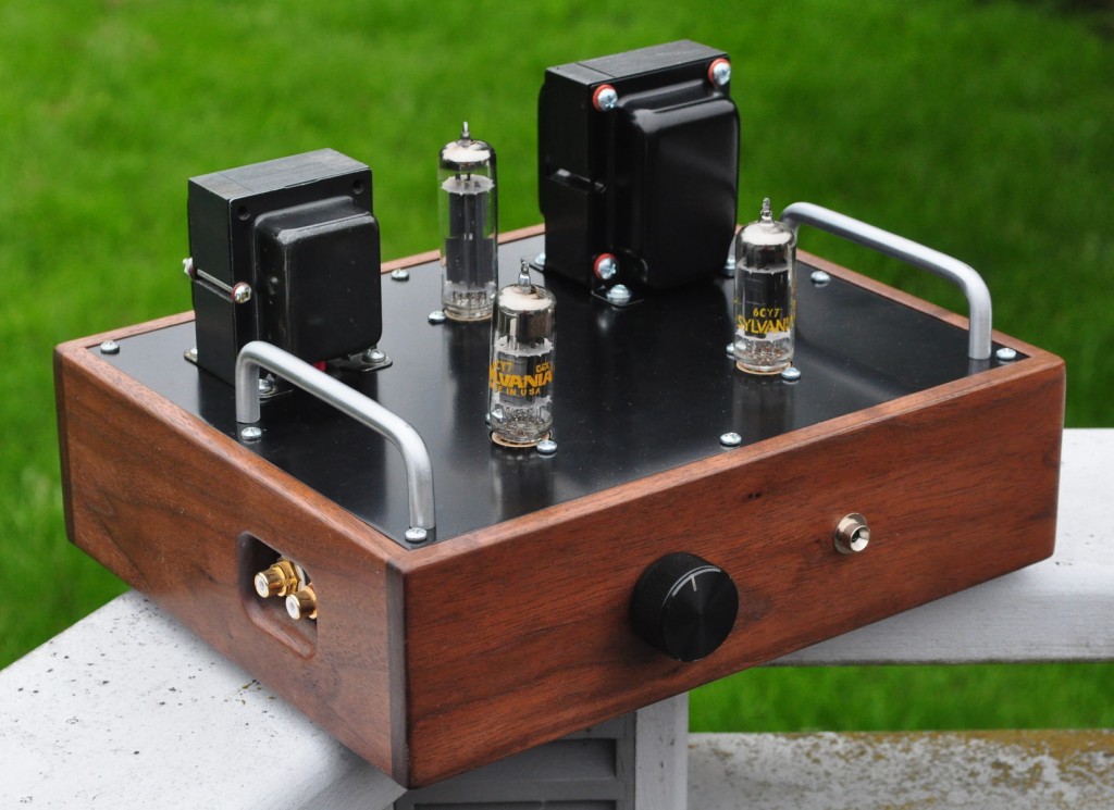
If you look at the chassis I used on the original 6CY7 amp you’ll see that it has simple 1/8″ radius round overs on the corners of the chassis itself, but 1/4″ radius round overs around the signal inputs as seen in this photo.
This approach is also the one I used on the 6DJ8 Headphone Amp. This allowed for a more defined look on the outer lines of the chassis but still mirrored the tubes with the openings.
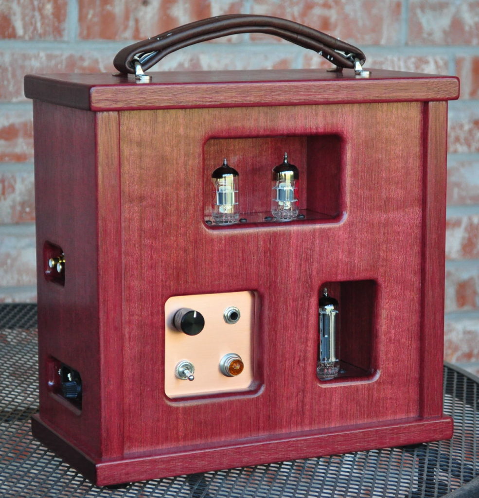
On the bubinga chassis I’m also not sure I like the sharp edges around the meters. For the meters I really prefer the look of those on the “Purpleheart” Signal Meters chassis.
I like the way the wood seems to “fold into the meters” so to speak. It also makes off angle viewing a little simpler without blocking the sides of the meters.
And as for chamfers I simply don’t know how to even get a feel for that option.
So I’m looking for some opinions. Should I leave it as is for a different look? Should I try the chamfers? Should I use my typical 1/4″ radius round overs? Should I mix it up with stronger round overs on the openings and smaller round overs on the edges? Frankly, the more I think about it, the more confused I get about how to proceed.
So what do people think? I really would like to know.
As always, questions and comments are welcome.


Hello Matt:
Thanks for the chance to comment on your design. I have made a few amp projects and am always second guessing my decisions after I am completed. When I am completely unsure of something I make mock up models from scrap wood to get a feel for how things are going to look in relation to the rest of the project. For a lot of folks the aesthetics of the project is more important than the sound but that is a whole other discussion.
Here are some thoughts to consider:
The outside corner edges could be “eased” with a 1/8″ round over. 2 reasons; it will hold the finish better than a crisp edge allowing for a little bump and grind over time, and it will soften the very crisp look. It will appear square yet have a more refined look. Even folded metal chassis have ~ 1/8 rounded edge.
For the relief openings on the gauges and controls I would consider one of two things either a 45 degree bevel set for a 1/8″ shoulder on the hole (Remembering to make sure the screws do not show through on the bevel side) or a 1/4″ round over. Either of these techniques will open up the viewing window of the gauge and controls. The gauges will be seen better from the sides and fingers will fit more easily into the control panel. Without and treatment the gauges and controls appear to be a little recessed.
Make a mock up model: you have used jigs to cut the holes out, so it would be easy enough to make up a model and try out what ever idea you land on to confirm you are happy with the out come.
Thanks for the opportunity to comment
I think making a chamfer inside the rectangles will be tough. If you want a less soft look then I vote 1/8″ round over on everything.
My vote would be for rounding over. Gives a more finished look.
Agree 100%
Maybe a compromise, round the cutouts in the chassis, leave the edges sharp? What ever you do it will be beautiful, the wood is gorgeous.
I prefer the soft edged look of the “Purpleheart” Signal Meters chassis. 1/4″ radius all round. I have two sets of speakers and a subwoofer always in use, all made from MDF and painted. Before repainting a new color, I put a 1/4″ radius on every edge. What a difference. The big boxy look was gone.
That said, The Source Selection Unit chassis has a sharp modern look that appeals in a totally different way. Maybe place the chassis where it’s going to be used under the CD player to get a better idea.
I’m sure you’ll make the right choice Matt.
Thanks for the almost daily posts. It’s great to see it coming together.